Border-Box Explained (with help for ie6 and ie7)
January 18, 2013Tweet
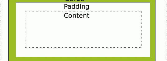
One of the first things a web developer learns is the box model. The inside part is the content, then comes padding giving the content some room to breath, then there’s the border, and finally the margin.
This forms the basis of our web knowledge. Everything builds on from there especially when we talk about layout.
Let’s say we had a paragraph element and set that element’s width.
p{

          width: 200px;

          }
A common way the box model is often understood is that everything from the border inwards is the “main” box and the margin is the additional little something something around it. This understanding has the unfortunate effect of making it seem as if we are declaring that everything from the border inward would equal 200px.
However, “out of the box,” so to say, the “width” attribute only affects the width of our content area.
p{

          width: 200px;

          padding: 10px;

          border: 10px solid black;

          }
If we were to measure our element now, from edge of border to edge of border, we would find it to be 240px wide. While there is nothing wrong with the specs’ implentation of the ‘width’ attribute, this can pose a problem to developers especially in the creation of fluid, horrizontal grids.
Let’s say we want our site to be made up of two equal columns. We want each column to be one half of our browser window no matter what the size.
.col{

          width: 50%;

          float: left;

          }
While this does satisfy our conditions, this would not be very visually appealing.
There isn’t much space in between our two columns of text. However, setting padding breaks our grid.
.col{

          width: 50%;

          float: left;

          padding-left: 10px;

          padding-right: 10px;

          }
In a pixel based grid we could of course subtract the padding from our set width in order to fix the grid. However, we do not have that course of action when we use percentage widths. Thankfully, there is a solution (an amazing one at that).
.col{

          width: 50%;

          float: left;

          padding-left: 10px;

          padding-right: 10px;

          -webkit-box-sizing: border-box; /* Safari/Chrome, other WebKit */

          -moz-box-sizing: border-box; /* Firefox, other Gecko */

          box-sizing: border-box; /* Opera/IE 8+ */

          }
The ‘box-sizing’ attribute controls how we want the browser to interpret the width of our ‘box’. So instead of our ‘width’ attribute only controlling the content area it also incorperates both our padding and border (if we set a border);
We can also set our entire document to follow this rule as follows.
*{

          -webkit-box-sizing: border-box; /* Safari/Chrome, other WebKit */

          -moz-box-sizing: border-box; /* Firefox, other Gecko */

          box-sizing: border-box; /* Opera/IE 8+ */

          }
We can now put borders and padding on columns without any worry.
Well, almost. Can you guess what browser has issues with the ‘box-sizing’ attribute?
Specifically, ie7 and below does not recognize this attribute. If having your grid work on these browsers is an issue there is one more step you must take. The github user Schepp has created an amazing polyfill (code that compensates for missing technology in older browsers and in some cases for current browsers) that allows ie7 and below to use this attribute.
Download the pollyfill at its Github repository and include it in your script directory. Then place a ‘behavior’ attribute on the same line as your ‘box-sizing’.
box-sizing: border-box; *behavior: url(/pathto/boxsizing.htc);
And there you go. Border-box for everyone!
Bugs etc., Grids, Layout, Web Design and Development, Web Tutorials
Pingback: Siren 1140 Responsive Grid