Introducing the SASSy Siren Responsive Grid System
February 1, 2013Tweet
You can find the DOWNLOAD and DOCUMENTATION here.
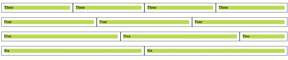
The SASSy Siren Responsive Grid System is based off of work done on Version 2 of the Siren 1140 Responsive Grid. It consists of a simple .SCSS stylesheet that can create a custom grid system based on easily editable variables. You can control the number of columns, the max-width of rows, the breakpoint, and the size of your gutters.
Being based on the Siren 1140 Responsive Grid v2 means that this grid system allows for nested collumns and rows and uses padding based gutters. Read this article to find out more about about the Siren 1140 Responsive Grid v2.
In the future expect to see a Compass Extension based upon this system but for now I’m happy to hand you the stylesheet I use to make simple responsive grid systems in the raw. Enjoy.
NOTE : Download comes with a preview HTML file. The markup is set up for a twelve column grid, you must edit the markup to trully see your grid in action.
Check it out: SASSy Siren Responsive Grid System
CSS, Grids, Layout, Plug Ins, SASS, Web Design and Development, Web Tutorials