Variables
$hundred : (Default = 100%) A variable for max width. Be cautious editing this; if you don’t have to then don’t.
$columns : (Default = 12) Sets the number of columns.
$base : Determines the size of the smallest column. Do not edit.
$maxwidth : (Default = 1140px) Determines the max-width of top level rows.
$breakpoint : (Default = 767px) Determines the maximum width for the single column “mobile” layout.
$gutterwidth : (Default = 20px) Determines the width of the gutters (spaces in between columns)
$padding : Determines the size of left and right padding to add to columns. Do not edit.
Using the Siren Grid Basics
Example of markup (no nested columns):
          Content

          More Content

          Last Content
.container : A wrapper around you content. Is the full width of the browser (unless you change the $hundred variable. You can have multiple containers with different backgrounds if you wish.
.row : Delimitates a row.
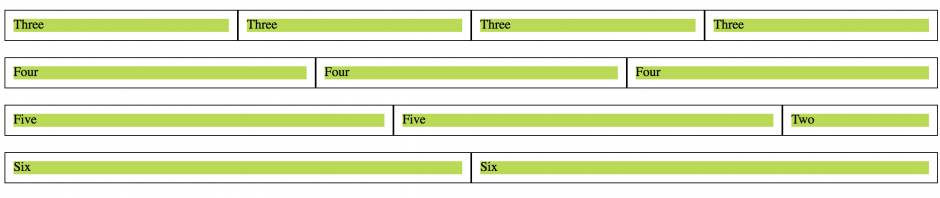
.col_5, .col_3, .col_4 : These are the columns. From smallest to largest they start at col_1 and go until col_X with X being equal to your $columns variable (the full width of the row). All added up, column numbers cannot exceed your chosen number of columns in a given row.
While most grid systems require a last class on the final column in a set, the SASSy Siren Responsive Grid System uses consistent gutters on all columns.
Example of markup (nested columns):
          Content

          More Content

          Last Content


          More Content

          Last Content
What did I do there? Simple, I placed a row inside a column. It allows us to further grid up our design. Read the introduction post for more information.