The Siren 1140 Responsive Grid v2.0 is a responsive 1140 grid that allows for nesting of rows and columns and uses padding based gutters evenly distributed and both sides of each column.
To install, link to the siren style sheet in the of your document.
Now we can continue on with laying out our grid.
Example of markup (no nested columns):
          Content

          More Content

          Last Content
.container : A wrapper around you content. Is the full width of the browser. You can have multiple containers with different backgrounds if you wish.
.row : Delimitates a row.
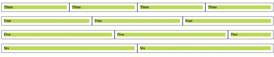
.col_5, .col_3, .col_4 : These are the columns. From smallest to largest they start at col_1 and go until col_12 (the full width of the row). All added up, column numbers cannot exceed 12 in a given row.
While most grid systems require a last class on the final column in a set, Siren 1140 Responsive Grid v2.0 uses consistent padding based gutters on all columns.
Example of markup (nested columns):
          Content

          More Content

          Last Content


          More Content

          Last Content
What did I do there? Simple, I placed a row inside a column. It allows us to further grid up our design.
Lastly, by default img, object, embed, and iframe elements are set to not exceed the width of the column they are within.
img, object, embed, iframe {

          max-width: 100%; }
img {height: auto; }
If this is not desired it may be removed.
Further Notes
I use the Meyer Reset in this grid. You can read more about it HERE.
If you happen to edit the style sheet, such as to remove the reset, please make sure that the box-sizing attribute is set to border-box for all elements somewhere in your styles. This allows us to put padding on our columns without affecting their widths. Further, if we want the grid to work on ie7 and below we must use Schepp’s Box-Sizing Polyfill
*{

          -webkit-box-sizing: border-box;

          -moz-box-sizing: border-box;

          box-sizing: border-box; *behavior: url(/pathto/boxsizing.htc);

          }
You can read more about this HERE.