About the Siren 1140 Responsive Grid v2
January 22, 2013Tweet
You can skip ahead and go the Documentation and Download for the Siren 1140 Responsive Grid v2 here.
Version 2 of the Siren 1140 Responsive Grid builds upon the original Siren 1140 Grid by reimagining how gutters are created. By using padding within the columns rather than margin between them Version 2 increases its flexibility of design while decreasing variation across browsers.
Like the original Siren 1140 Grid, Version 2 is optimized from 1280 browsers while using fluid responsive design to scale down to smaller browsers all the way to phones. Further, the Siren 1140 grid offers the ability to nest rows within other rows and columns without limit.
Intro to the Siren 1140 Responsive Grid v2
What is a grid system?
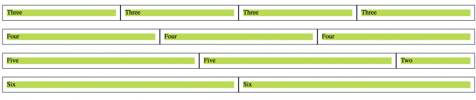
A grid system is an intuitive way to standardize the column widths of your design. The Siren 1140 Grid divides your content area into 12 even sections. These twelve sections can be manipulated using 12 diferent classes, .col_1 to .col_12, that each represent a width that is a multiple of are standard segment.
Using a tiny base and adding onto it alows for a ratio based horrizontal rhythm.
The importance of gutters.
Now that we have our content seperated into columns we need to provide some space between them and thus we have gutters. Gutters also are crucial for maintaining the horrizontal rhythm of a design and must be chosen carefully.
In CSS based grid systems, proper gutter creation can make or break a grid as it travels from browser to browser.
“Padding based” vs “margin based” gutters.
Most pre-rolled grid systems that you can find use margins to create gutters. These type of gutters must be percentage based and are often floating point numbers ( they have themselves some decimal places ). This increases the likelyhood of the edge of a column falling in the “zone of subpixels.” Because each browser renders subpixels slightly diferently this increases variation in appearance across browsers.
Further, margin based gutters, I find hinder rather than aid design. This is particularly true in the use of background images and borders.
The Siren 1140 Grid System Version 2 uses pixel based padding on both sides of all columns. Borders can be place directly in between content areas without the need of adding additional space and background images can exist within gutters for designs that desire such. While variation in appearance across browsers still exists this approach creates less variation.
( The box-sizing attribute allows for this type of configuration. The article “Border-Box Explained (with help for ie6 and ie7)” has more on this subject. )
Nested Rows and Columns
The Siren 1140 Grid allows for columns and rows to be nested within each other without limit. This allows for more intricate designs and playfulness with how the design responsively rearranges. The tutorial on the main page for this system will explain how this happens coding wise. The secondary columns do not collapse like the first level columns which allows you to keep some grid like properties on phones.
You can find the grid here: Siren 1140 Grid v2
CSS, Grids, Layout, Web Design and Development, Web Tutorials
Pingback: Introducing the SASSy Siren Responsive Grid System